
This past summer, I had an undergraduate intern working with me on one of my research projects. While it was intended to be a learning experience for the intern, this summer taught me many lessons about how to meet students at their level, how to try to inspire independence through facilitation, and, to be honest, when to give up. These were hard lessons, as I had such high hopes for the summer and refused to acknowledge the reality of the experience until mid-way through.
One thing that took up a significant amount of time was going over basic Excel manipulations, which meant that there was less time for experiments and overall analysis. So, in the hopes that this will help someone in the future, here is a guide for using Excel to find basic correlations within a data set. Please note that this is more of the starting point for this type of analysis, not the final product, as noting a correlation is what will draw you to study a subset of your data more.
What is Pearson’s Correlation Coefficient?
Pearson’s Correlation Coefficient (PCC) is a statistical measurement that signifies how well the trend of two data series matches. Say you have the following  dataset for trends in the sale of hot chocolate as it relates to the outdoor temperature. We might hypothesize that there would be some negative correlation between the two, as colder weather might encourage people to drink more hot chocolate. With the dataset 1, you see that, as temperature decreases, hot chocolate sales increase. Because I made sure this pattern always held, the trend in the data is almost same. So, when I calculate a PCC, I find that PCC= -0.978.
To best understand PCC, I recommend thinking of its absolute value (note – the absolute value, i.e. distance from 0, of -1 is 1). 1 is the highest value possible for PCC and signifies that the trends between two datasets are the same. In practice, you will likely never get a PCC=1 or -1; data from real experiments is too variable. We distinguish instead by the degree of correlation. When a PCC value of > 0.6 or < -0.6 is found, we can say that the correlation between the two datasets is significant.
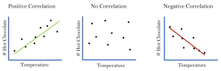
The positive vs. negative sign of PCC signifies the type of correlation: positive or negative. When datasets are positively correlated, an increase in one variable coincides with an increase in the other variable (or vice versa, with both decreasing). A negative correlation, instead, occurs when an increase in one variable coincides with a decrease in the other variable. In our example, a decrease in temperature was seen when hot chocolate sales increased, which is a negative correlation. If a decrease in temperature coincided with a decrease in hot chocolate sales, then we would have a positive correlation between the two data sets.
PCC in Practice: How-to Set Up Your Analysis
For the experiment I was conducting last summer, we used concentrations of different waterborne bacteria as our quantity. We measured their concentrations in the Hudson River once a week to create a time series, thus giving us data we can use for trends and PCC. We were most interested in looking at the correlations between fecal-indicator bacteria, like Enterococcus, and pathogenic bacteria. This way, our work was a test on the efficacy of Enterococcus as an indicator: does it accurately predict the concentration of pathogens?
To answer this question, we decided to determine the PCC between Enterococcus and all other bacteria we studied. At the same time, we calculated PCC between each pair of bacteria, as it was a simple addition to make.
Introducing Our Example
To get ourselves set up for a table, let’s imagine data where we have 6 different items we are trying to correlate. Since we’ve started with #hot chocolate sales with respect to temperature, let’s add in a few additional items: # ice cream sales, # ice skate rentals, # fried dough sales, # people. The situation I’m imaging is Bryant Park in NYC during the winter time. It’s a very cute park, which gets filled with a huge ice skating rink, various vendors, and lots of people. I haven’t tried the fried dough cone, but it smells heavenly – drenched in chocolate and full of all things not good for you. Luckily for my arteries, the dough cones’ price has deterred me so far!

With these additional variables, we’ll have to create a much bigger table to encompass the data. See table “Dataset #2” for the numbers we’ll use for this example. Of course, remember that these numbers are completely made up by me and they’re just here to help illustrate how to calculate and interpret Pearson’s Correlation Coefficients.
Based on this data, we can already see a few likely trends. It looks like the decrease in temperature often coincides with an increase in hot chocolate purchases, as we noted before. It also seems that decreasing temperatures coincide with decreasing numbers of ice cream purchases, though a few brave souls will still eat ice cream in cold weather. We also an increase in ice skate rentals at Bryant Park when it gets colder. All these more obvious correlations make sense to us logically. But let’s do a correlation analysis to make sure we’re interpreting the data correctly.
Preparing Your Table
What I recommend for setting up your analysis is a basic table with your different items to correlate along the top and the left-hand side. Think of this like reading a Battleship board. You’re correlating the item from the row to the item from the column. So, instead of B/1, we would be looking at # hot chocolate/Temperature.
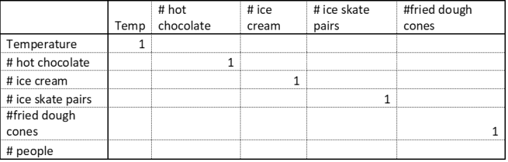
You’ll see that I put the number 1 in boxes where the variables match. This is because when you take a data set and compare it to itself, you’ll always get a PCC=1. The trends in both data sets are exactly the same, so it should make sense that they would be perfectly correlated.
The next step is now calculating a correlation coefficient. Luckily, Excel has you covered with the built in equation CORREL. To set this up, go to your first open cell (row 1, column 2 i.e. Temperature/hot chocolate). Type “=CORREL( ”. Then, select or type the first dataset you wish to use (temperature). Type “,”. Now, select the second dataset you wish to use (# hot chocolate). Your final equation should look something like mine: =CORREL(A2:A8,B2:B8) . Press “Enter” and you should get a value. In this case, your correlation value should be -0.947.

Something else that might help make this easier is to darken the cells below the diagonal line of 1s, as done in the image to the right. You don’t need to fill these in because you would get the same information. Essentially, CORREL(temperature, hot chocolate) is the same as CORREL(hot chocolate, temperature). Why do more work? 🙂
Continue to follow this process for calculating PCC for each other pair. A trick in Excel that might help you is to type CORREL($A2:$A:8,B2:B8). Then (after pressing “Enter”), you can hold your cursor over the bottom right corner of that cell and drag it across. By typing $, you’re telling Excel to hold that formula for the rest of the row. This trick will help you populate the table faster.

Once you have finished filling the table, a way to make the data even easier to read is to use Conditional Formatting (above image), which is an Excel function that lets you change the color or format of cells depending on a rule you set. When I make a PCC table, I like to make my significant positive correlations (rule: # > 0.6) to green and my significant negative correlations (rule: # < -0.6) to red.
Interpreting Your Data

Now that we have a very easy to read table, we can clearly see that there were strong positive correlations between:
- ice cream sales and temperature,
- hot chocolate sales and ice skate pairs,
- temperature and the number of people at the park, and
- ice cream sales and the number of the people at the park.
We can also clearly see that there were strong negative correlations between:
- temperature and hot chocolate sales,
- hot chocolate sales and ice cream sales,
- temperature and the number of ice skate pairs rented, and
- ice cream sales and the number of ice skate pairs rented.
At the same time, the values that don’t meet these criteria (unshaded cells) are neither positively or negatively correlated (significantly). We would call those uncorrelated.
Correlation Does Not Mean Causation!
This is a phrase you may have heard before and it is very important to understand, especially when doing broad correlation analyses, like we just did here. Just because two data sets are correlated, it does not mean that one causes the other. For example, think about the very strong positive correlation (0.96) between the number of ice skates rented and the number of hot chocolates purchased. Even though this relationship is strong (remember, values closer to 1 in absolute value denote stronger correlations), we cannot say that more ice skates being rented meant caused more hot chocolate to be purchased. And vice versa: more hot chocolate being purchased did not cause ice skates to be purchased.
To find the causal parameter, we need to apply some logic to the correlations. What was strongly correlated with hot chocolate? Temperature (positively) and the number of ice creams purchased (negatively). Now, the ice cream falls into the same category as the ice skates: we cannot say that people buying less hot chocolate caused people to buy more ice cream. However, temperature is the likely causal factor. If the temperature goes down, ice skating is possible, so more ice skates will be rented. Also, if temperature goes down, there might be more people in search of warmth through hot chocolate, while fewer people would like to make themselves colder with ice cream.
Correlation vs. Causation in Practice
This is the kind of logical analysis that scientists do all the time when looking at a multitude of data and trying to find causal parameters. Anthropogenic influence in global climate change was approached in a similar, though much more complicated way. Scientists spent (and are still spending) years looking at effects such as increased flooding, rising temperatures, disappearing ice caps, and shifts in ranges of various animals. Through extensive analysis, most scientists conclude that human actions like wetland destruction and high greenhouse gas emissions (CO2 and CH4 in particular) are not just correlated to these global changes; they are causing them.

Leave a comment